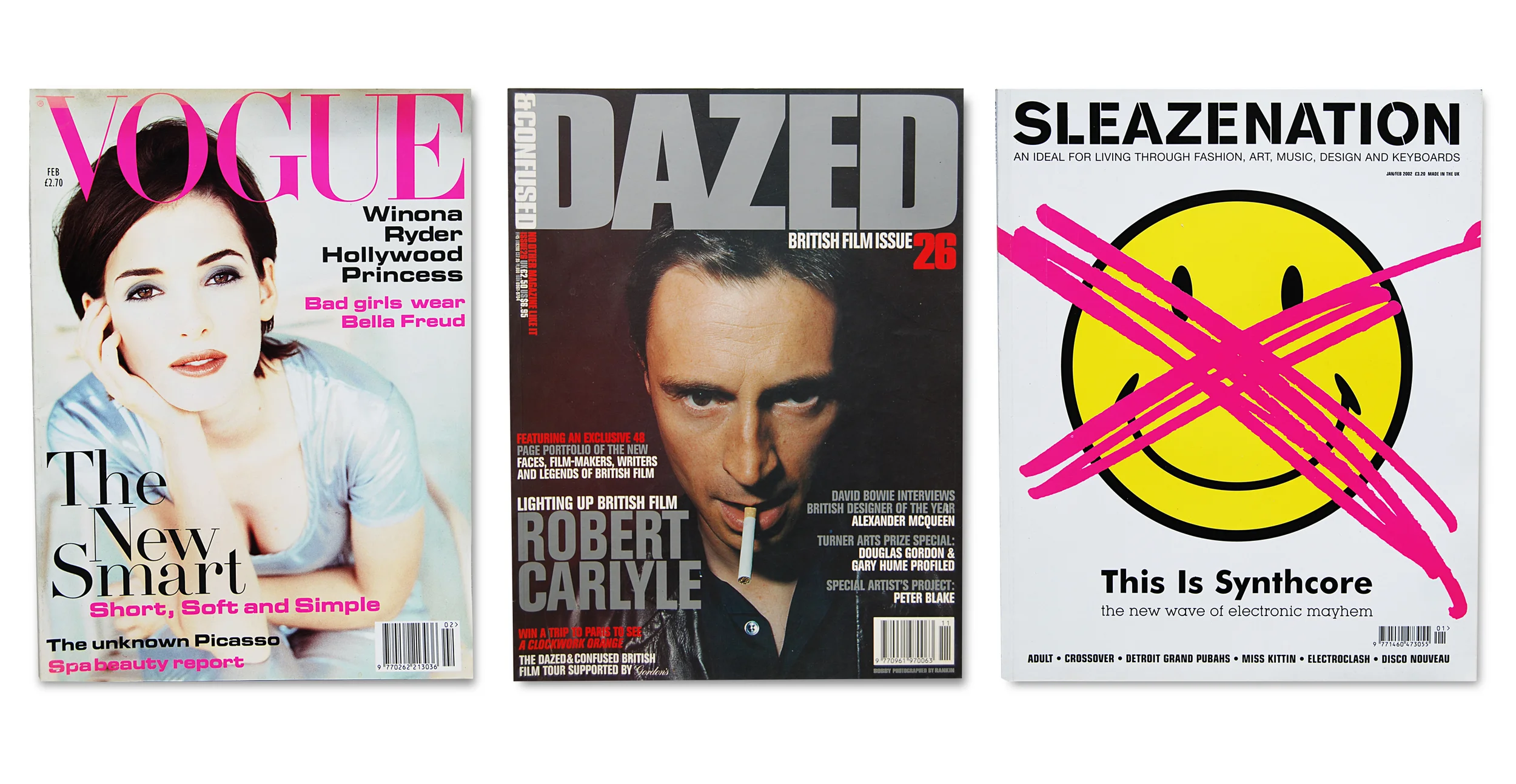
It has been four months since my last magazine (Little White Lies Issue 50).
A recent loft expedition to store away (dump out of sight) some object or other, led me to forage a little into taped-up boxes. Sadly no unveiling of an ageing portrait, but instead, amongst the old toys and paint pots, box upon box of publications from the late 70's onwards. Undeniable evidence of a magazine junkie.
Look-in, my first printed love. Nine pence handed over every Thursday – rising to fifteen pence around 1980 – to pore over 'top picture strips' Benny Hill, Sapphire & Steele and Battlestar Galactica. The joy when Blondie graced the cover in 1979. If Look-in dominated the primary school years, then Just Seventeen, launched in 1983, defined my early teens. But we the readers, were not 'just seventeen', we were a barely-aged-thirteen gaggle of school-girls huddling round each new issue to read the explicit advice page and learn a thing or two about growing up. In 1988 came SKY magazine. Oh how I adored SKY in its early years. On order from the local corner shop, SKY opened up the world to me in my seaside home town. Frequently fronted by Madonna, its favourite cover star, and aimed squarely at both sexes – a major plus point in my eyes – it told tales of emerging street drugs and gang culture.
Art college arrived and with it came the style behemoths: i-D, The Face and Blitz. Of the three, only i-D – giving us the wink since 1980 – resides on shelves today. Blitz ran from 1980 to 1991 and The Face from 1980 to 2004. The graphic designer's 'God' of the eighties, Neville Brody, designed The Face from 1981 to 1986. Brody's groundbreaking work, much of it influenced by his interest in Dadaism, Futurism and Constructivism, revolutionised the look of magazines and design in general. Sad days indeed when these two eighties 'style bibles' folded. Together with a magazine-loving college cohort, we lessened our food bills and increased our monthly magazine intake. Titles were actively sought, import prices paid, and the American pages of Raygun and Interview were perused. David Carson, acclaimed graphic designer known as the 'Godfather of grunge', art-directed Raygun in its early years from 1992, showcasing his experimental, not always legible, typographic techniques. Raygun folded in 2000, a few years after the probable end of the grunge era itself (see - The Rise and Fall of Grunge Typography by Sharan Shetty). Originally founded by Andy Warhol in 1969 and still going strong, Interview championed its 'stars talking with stars' format (admittedly I soaked up the typography and style more than the conversations).
Dazed & Confused, (recently relaunched as Dazed) founded by Jefferson Hack and photographer Rankin in 1992 became my new paper best friend for the nineties, journeying with me into the new millennium. Initially given free to clubbers, Sleazenation launched as a high street magazine in 1996, and in the same year, Wallpaper* opened its Scandinavian drawers and gave us its 'global authority on design'. Launched by Tyler Brulé and Alexander Geringer, Wallpaper*'s tagline read: *The stuff that surrounds you. Well, I could but dream. My monthly film fix came courtesy of Sight&Sound and later joined by the bold, and beautifully striking, bi-monthly Little White Lies. There were others of course, piles of film magazine Empire, interior design Cosmopolitan Home, entertainment and arts 20/20, Creative Review, Design Week, Eye, NME and the odd international title in German – I just gazed at the photography.
With pregnancy came a magazine identity crisis. Which section did I now belong in? Not ready for the pastel soft-focus hues of the parenting shelf, and distanced from Wallpaper*'s un-child-friendly interiors and the late-night style culture of Dazed & Confused, resulted in a publication limbo. For some years my magazine habit was abated by Thomas the Tank Engine. Then a relapse. Whilst living in Australia, I had found a new bi-monthly to treasure, Frankie – for all things handmade, vintage, and for those with a doily obsession.
I admit, a paper cull is needed, or a bigger house; I fear this one will collapse under the colossal amount of 90gsm. But for the moment, this unearthing of my 'precious things' has been a rainy day memory trip through past decades, the recalling of a life lived through magazines. A huge beautifully styled photo album of people I've grown up with but never met. Many artists are no longer with us, some grew to immense popularity and others vanished. Styles have been, gone and returned again. Typography has looked clean, become dirty, and today, is lovingly hand-drawn. I confess, my magazine addiction was far greater than I had thought. So I ask, for the sake of house space; do not lead me back into temptation, let me pass WHSmith without succumbing to the gravitational pull of a well-designed cover (I'm hearing the sirens' call of Little White Lies) and finally, let us not bring back the day-glo, again.


